ANIMATING SPOOKY HOLLYWOOD

This is Interesting

I was really lucky to get the chance to work with NZ musician Jackie Bristow again, developing a new music video for Jackie B and the Mini Band. Jackie works with young kiwi girls through Song Catcher, a program where Jackie and local young artists collaborate to write an album. The track I was asked to work on was a halloween themed song called Spooky Hollywood. Jackie gave me free rein to develop a story and characters that matched the mood and fun of the song.

I started with a simple story pitch where 6 young trick or treaters dress up and go door to door through Hollywood for halloween but it’s revealed that while they are all dressed up as monsters and ghouls one of them isn’t actually in costume. I did all of the storyboard work and after approval moved on to character design. I love halloween and dressing up all six characters was lots of fun. I also really enjoyed coming up with variations on the styles.

I taught myself some simple animation for this project, some frame animation was used to animate the ghost reveal at the end of the clip as well as for the mouths singing along to the music. I had fun using filmic techniques like playing with a lens focus or simple pans and zooms to help with the storytelling and editing to the beat of the song. Working as editor and illustrator I was able to animate on the fly, discovering as I went how to fill in little gaps that needed more movement or even extra shots.

Working in a moody blue palette and having some iconic Hollywood themes to work with, I really enjoyed creating all the backgrounds for Spooky Hollywood. Especially setting the scene with this long pan up Hollywood Boulevard.

The previous music video I made for Jackie B and the Mini Band won me a Stanley Award at the Australian Cartoonists Association annual dinner last year, for which I was very proud. Spooky Hollywood will be entered in the animation category among other works in 2024.

To see Spooky Hollywood and hear the Mini Band in full spooky chorus, click the link below. give us a like on Youtube as well why not.

Deep Sea Cartooning

Drawing, This is Interesting

In 2021 I was was really lucky to be introduced to singer/songwriter Jackie Bristow who had recently collaborated with young Kiwi kids two write and record original songs during lockdown as Jackie B and the Mini Band. The group had written songs about saving the environment, space and time travel. Jackie asked if I’d be interested in creating an animated music video full of pirates and deep-sea mysteries. The song was Davy Jones’ Locker.

After listening to the songs I turned verses into scenes and developed a story about a misunderstood pirate king who just wanted new friends to come to his birthday party. I developed this into a storyboard with notes on movement and how each shot would line up with the lyrics.

After the storyboards were approved I moved to the character design stage and developed three very different versions of Davy Jones and an example of one of the pirates. This was my favourite part of the process and felt like the characters were coming to life. We landed on the seahorse-bottomed design and added some long white deadlocks.

I also had to give the characters a place to live, so started developing backgrounds. I loved the moody melancholy vibe of the song and wanted the deep bluish sea tones to match that. I’ve always been a fan of Maurice Noble’s background designs in Looney Tunes cartoons and I hope you can see some of that inspiration creep into the squiggly bushes, tall jagged cliffs and splattered stars.

With all the elements sketched up and approved I worked with my mate and excellent editor/animator Brad Goosen to bring the flat illustrated elements to life and pair with the musical track to take you below the surface and into Davy Jones Locker.

I loved working with Jackie. Even though we were communicating via email and zoom, separated by the Tasman Sea and strict covid restrictions, sharing every element of this process with her was exciting and rewarding. I’ve always wanted to work on a music video. I’m glad this was my first one.

My illustration, storyboard and background work has been nominated for a Stanley Award in this years Australian Cartoonists Association annual awards night. Fingers crossed I can bring home some treasure.

Check out the the video here.

Painting Badiucao

Painting

In early December 2019 New South Wales had ninety bushfires burning in the state, thirty nine of which were out of control. I drove from Sydney to Canberra through thick brown smokey air and past blackened patches of burnt out bush to attend my first annual conference of The Australian Cartoonists Association. Driving around the empty Lake George on my approach to Canberra a brown ashy bushfire cloud on the other side of the lake was sucked up by the wind turbines next to it. Climate change was supercharging the bushfires and we should be doing more to combat it. These little pinwheels on the horizon looked like political cartoonists, waving their arms at Canberra, with a good dose of visual irony, pleading those in power to do better.

I have always been passionate about politics and as an artist decided to use my powers for good and began creating political cartoons. Joining the ACA made me feel like a more grown up cartoonist which sounds like an oxymoron but I was excited and anxious to listen to the guest speakers and rub shoulders with Australian artists I really looked up to.

One of the guest speakers was Badiucao, a Chinese-Australian artist/cartoonist /activist. His cartoons and artworks criticise Beijing and the CCP. He created the Hong Kong freedom flag, worked with Ai Weiwei in Berlin where he developed the Tank Man protest held on the anniversary of Tiananmen Square massacre and had recently featured in a documentary China’s Artful Dissident where he reveals his identity after being masked and anonymous for years – earning him the title ‘Chinese Banksy’.

巴丢草 Badiucao on Twitter: "#badiucao Cartoon on How Chinese government is  silencing Australian academic, @CliveCHamilton and his new book  #SilentInvation Also New Street art in#HoseirLane, #Melbourme News  background: https://t.co/Zrb702JlmS… https ...

Meet Badiucao, the Dissident Cartoonist Taking on Beijing | Time
Artworks by Badiucao

By chance I ended up sitting next to Badiucao at the ACA Stanley Awards dinner, held in the dinning hall of Old Parliament House. We talked about our art practice and what was happening in Hong Kong. Badiucao received an award that night for bravery in cartooning.

I try to enter a portrait in the Archibald Prize every year. I had painted political satirists the last two years with portraits of James Colley (2018) and Mark Humphries (2019) and was keen to continue this trend as I believe political satire is a healthy product of a democracy and they should be recognised alongside the other Australians featured in the Archibald for their vital contribution to culture and political debate. Badiucao agreed to sit for the portrait and we would meet for the sitting in 2020.

The sitting took place in Melbourne while he was setting up his exhibition Made in Hong Kong, Banned in China. After the sitting, Badiucao took me through the exhibition before its opening and we parted ways not knowing that 2020 would close boarders, push back deadlines, and turn into the year that it has.

My final portrait was painted on a woodblock that I carved before applying paint. This referenced Badiucao’s art style which itself references the printing technique of communist propaganda poster design. It’s a reference to how cartoons can be quickly and broadly distributed, and also a nod to ‘wanted’ posters. During the portrait sitting we discussed the art of woodcut printing. While in Berlin Badiucao took inspiration from Käthe Kollwitz who used the technique to illustrate peasants and working class struck by poverty and hunger during wartime. My finished portrait also works as a functioning printing block.

Painting a portrait of someone who has had their face hidden for years is an odd challenge, however Badiucao’s huge black beard and distinctive glasses has had him emerge from his mask with a very iconic look that feels like a bold expression of identity that I felt had to be captured with a bold graphic style.

Finalists for the Archibald Prize are announced on the 17th of September.

Painting Mark Humphries

Painting

IMG_4912

“I’d love to paint him like a weird mole that turns out being an unformed conjoined twin… you know… mostly hair and teeth”

At about 1.30am at a housewarming in Enmore, I garbled that awful pitch to my friend Greta (loudly) over the house DJ that was blasting music that was frankly aggressively too youthful. Greta was a presenter on Tonightly on the ABC. Tonightly was, at the time, breaking the mould for the ABC, putting politeness to the side and shooting for jokes based on raw honesty – speaking truth to power. The turnaround was only 7 days but the show was able to churn out brutal gold every week. Greta and I started our artistic careers at UNSW and like me and some other friends at UNSW and USYD, happened to find ourselves turning our comedy skills to politics. I didn’t plan to get into political cartooning but I felt a responsibility to do so and also realised how much of a goldmine Canberra was, so I started panning. The ‘mole’ I was shouting about to Greta was Mark Humphries, a mate of Greta’s and another political satirist. Greta said she’d set up a meeting to kick us off.

Mark who has described himself as a ‘poor man’s Baby John Burgess’ and ‘the Bondi Vet’s evil twin brother’ is the co-host of Network 10’s Pointless, formerly on The Feed on SBS and currently on the ABC with the 7:30 report in the satirical comedy slot. I was a big fan of Mark’s work as soon as he hit the scene. He had the sheen of a young David McGahan and the hair of a young wheat field. He has wonderful presence on screen, was consistently funny and cutting and even if he wasn’t keen to sit for a portrait I wanted to meet him.


Mark said ‘yes’ to the portrait and in the first sitting we got on like a horse on fire (loud and quick). Over the last few months while sketching, painting and bringing Mark in for more sittings, I moved away from focussing on the gameshow host of just ‘hair and teeth’ and moved towards painting Mark as his political satire persona, an on the ground reporter. The painting then required a powerful stance with heavy colour and line but the character had to be undercut in some way so, as well as a cheesy pose and hinting smirk, I took the might of the nations capital and sifted down to it’s most daggy and simple icon with the Canberra bus shelter for the background.

F6C3ADC3-16D5-4ECD-986E-428F82EBF8A7

We delivered the painting at the end of the week and ate lunch at the gallery. I have my fingers crossed for the Archibald Prize in a months time but mostly am proud to have painted this work and promoted political satire a little more in Australia.

“Troppo vero!” (“Too Right!”)

Painting

img_2144.jpg


Back in 2014 when I was a couple of years out of Uni and on the look out for illustration jobs, I came close to drawing cartoons for a book that explained physics entirely through jokes, the book wasn’t picked up but I kept in contact with the author, James Colley. James and I met through different university comedy societies, James continued writing and I kept drawing and we both marched forward without losing our comedy roots.

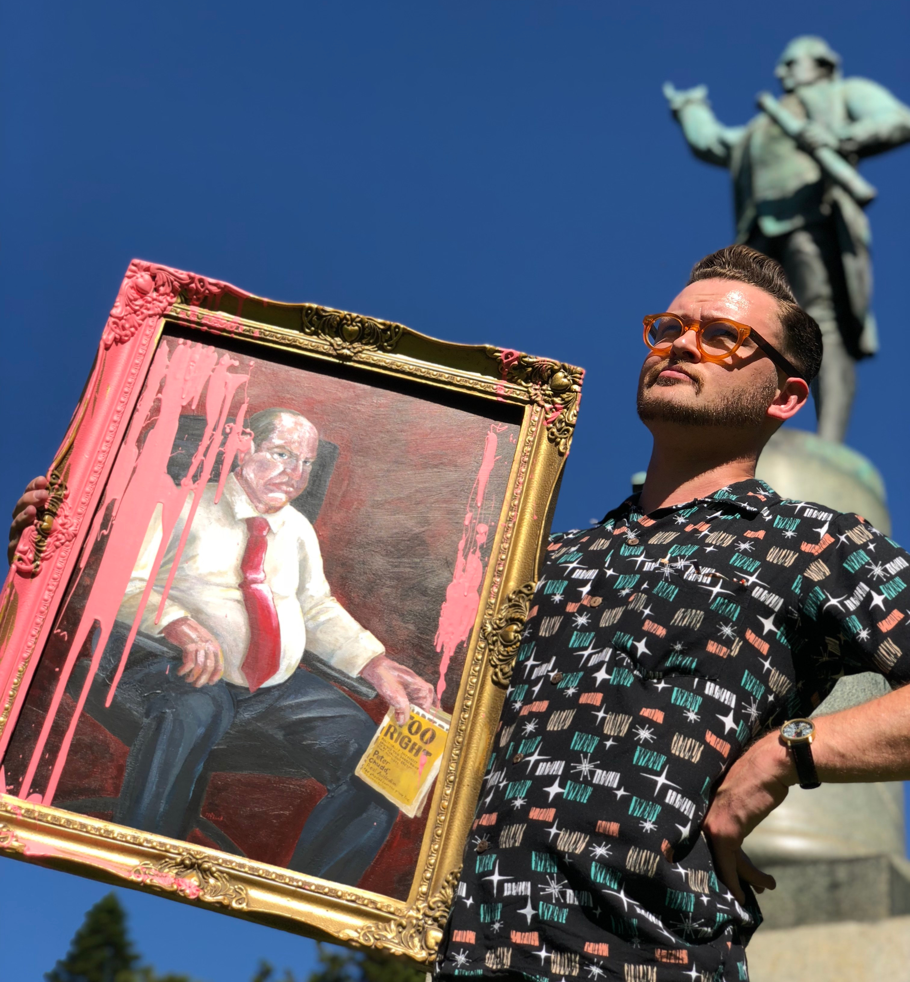
Nominated for a Young Walkley, creator of  SBS Comedy’s The Backburner and Nailed It at Giant Dwarf, James also works on ABC TV’s The Weekly: with Charlie Pickering and Gruen. James has his teeth well and truely sunk into the Australian political satire scene and in 2017 released a book as his right-wing political commentator character, Peter Chudd. The book: TOO RIGHT – Politically incorrect opinions too dangerous to be published except that they were by Peter Chudd*, Real Australian (*as shouted down the phone line to James Colley) should have a shorter title and more chapters. It was a snort to read and I wanted more, so while reading the last chapter I asked James if he would sit for me for a portrait as Peter Chudd. Chudd is the kind of character that would assume artists would be chomping at the bit to paint his likeness and would also assume that if the portrait wasn’t picked as a finalist in the Archibald Prize it would somehow be an infringement of his god-given free speech.

The books blurb:

Move over Alan Jones and Andrew Bolt, Australia’s leading conservative privileged white man has arrived. And even better, he’s written a masterpiece that dismantles every loony left – or even vaguely moderate – political argument ever made in this country! 

In Too Right, Peter Chudd, Australia’s most controversial far-right columnist tells it like it is, unafraid of who’s ‘offended’ by his ‘poorly researched’ opinions. Global warming? The only thing warming the world is the hot air from environmentalists. And what would climate scientists know about climate science anyway? Welfare? Well, that’s anything but, well, fair. Racism? Every columnist has a right to be a bigot – and how dare people dismissive him as a ‘white man’.

Read the tragic story of how this wealthy, privileged man believes he is, against all odds, the most maligned, victimised, discriminated-against person in the entire country for simply daring to speak the truth. Understand his dismay when people describe him as a hideous husk of a human who’s single-handedly tearing the nation apart.

Often portraiture, and portraiture in the Archibald Prize have paintings that are based on a previous portrait or artwork from history. My portrait of the Umbilical Brothers two years ago was based on a Raphael portrait called “Madonna of the Goldfinch” My artwork used the physical position of the two central figures and surrounding background as a reference – it was named “Umbilicals of the Goldfish (after Raphael)”. By referencing a historic portrait it elevates your own art and draws a thematic line between your subject and the one being referenced or the original artist.
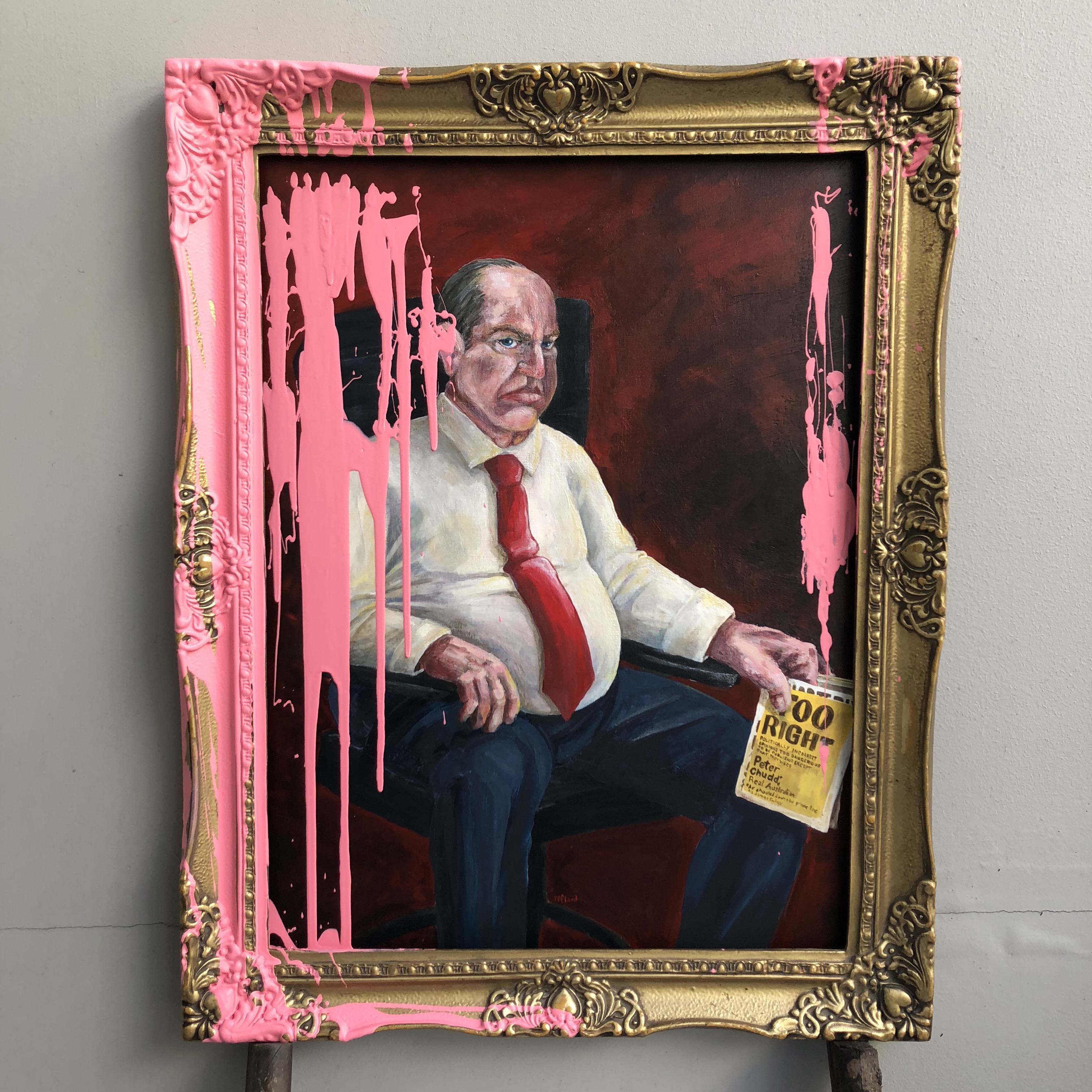
For the portrait of Peter Chudd (AKA James Colley), I borrowed the expression and physical pose of Velázquez’s portrait of Pope Innocent X. It is notorious portrait also famous for being reproduced by Francis Bacon in his Screaming Popes series. By painting Chudd in this way I am portraying him as a pious stern character, a man of great power. I saw the painting at the Doria Pamphili Gallery in Rome two years ago and is a fiercely personal and true portrait.


“Troppo vero!” is what the pope exclaimed when he first saw Velázquez’s portait, this translates to English as “all too true” you could say it translates to Australian as “too right”. So I named the artwork “Troppo vero!” (“too right”) Portrait of Peter Chudd (after Velázquez). 

IMG_2095

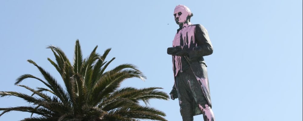
But I felt the portrait itself needed an element of performance. Earlier this year on January 26, a statue of Captain Cook in Melbourne had a bucket of pink paint poured over it as part of the #changethedate protests. This was an event that fuelled so much outrage for right-wing political commentators. The pink paint that is poured over my portrait of Peter Chudd would have him screaming ‘censorship’ and the event on Jan 26 would easily have been a news article he would hammer for weeks blaming the ‘intolerant left’ for their disrespect and violence.


My twitter post before delivering the work on Thursday:

screen-shot-2018-04-13-at-4-13-14-pm-2.png

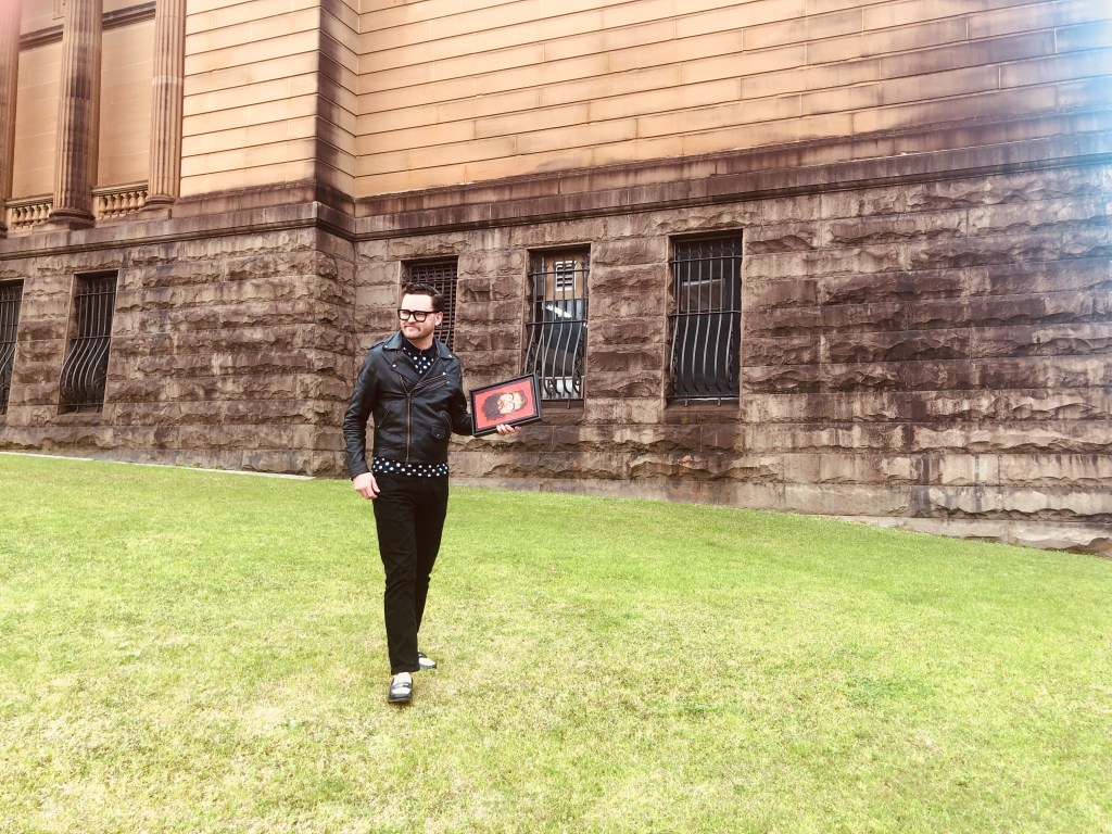
James has been wonderful and energetic through the process and is an all round nice dude. It was great to finally collaborate with James and on the year I scored a gig as a political cartoonist (goat.com.au), James Colley was the perfect person to paint.

I Heart Apps

Design, Drawing

EXPRESSIONS sketch.jpg

The My Heart Mate app is now live. Working for Flying Bark Productions, I supplied the character and world design and layout for the app that is used by people hoping to strengthen their heart health. The app has you adopt a heart character that you name and keep healthy via brain challenging games as well as real world activities that are designed to maintain good heart health like; exercise, relaxation and a healthy diet.

The character design process saw a few shaped and coloured hearts until we hit one that was appropriate enough and cute enough. The process of creating different versions of the same character and refining down in to the right one was really enjoyable.

OPTIONS

more designs

Once my job was done my designs were used to render and animate the little guy and now it lives in the app, providing people with an entertaining way to recover and keep their health in check.

The app is available to download on iPhone and Android.

R.E.S.P.E.C.T

Drawing

FullSizeRender

Last week I did some work with BMF to create a whiteboard animation for The Full Stop Foundation. A foundation that supports victims of sexual and domestic violence.

It was International Women’s Day this week and as well as celebrating the achievements of women worldwide the day also exists to bring awareness to the trials and persecutions women still face today. I know survivors of domestic violence and realise that services like Full Stop’s 1800RESPECT can be truly valuable in being the first step in leading women to a more positive future.

I’ve always wanted to take part in a whiteboard animation as I feel it is a very powerful way to communicate information and statistics. Using simple cartoons to illustrate such a serious topic is a delicate process especially when depicting scenes that may be triggers for some people. Cartoons, which are commonly used to lampoon people and situations, can conversely be used to describe things in a simpler way that is easier to digest while still being engaging. I’m very happy that my introduction to this style was for such a vital service. You can make a donation to the foundation here. Please do.

If you or anyone you know has or is currently suffering from domestic or sexual violence please reach out to 1800 RESPECT (1800 737 732)

Bothers of the Umbilical kind

Painting

My portrait of the Umbilical Brothers (David Collins and Shane Dundas) was entered in the Moran and Archibald Prize in 2016.


IMG_5071


In honour of their 25th anniversary as a performance duo, my portrait of the Umbilical Brothers (David Collins and Shane Dundas) celebrates their unique physicality, positivity, and longevity as artists. Lending from the form of Raphael’s 1505 painting “Madonna of the Goldfinch”, I created a joyous tableau that places the comedians among high art.


IMG_5003


I supplemented the faunal allegory of Raphael’s goldfinch, representing suffering, with a goldfish, representing good luck, something they have enjoyed a great deal of over the past 25 years. Also a goldfish looks funnier and is more fun to say.


Umbilical of the Goldfish - After Raphael


Both Shane and Dave were incredibly generous with their time, doing sittings backstage at the Roslyn Packer Theatre (where they were the first comedy show in the newly named venue) and more sittings in their hotel rooms in Melbourne during the Melbourne International Comedy Festival. They are both lovely blokes and I was glad to have the opportunity to paint Dave again after my first portrait of him in 2012. Why wouldn’t you want to paint bodies as bendy as theirs filled with such electric personality.

THE MAKING OF AN ICON

Design


Communicating visually and being iconic.

After celebrating my three year anniversary with Jigsaw I had a looked back at some of the designs I’d created and the skills I have learnt. One of my most constant design challenges was creating simple icons that have been peppered through our presentations.

After Jigsaw had a rebrand 3 years ago by Christopher Doyle & Co. we had a clean and crisp new design direction, as part of that design Chis created about ten icons to use in our presentations with the plan for me to create more as time went on. Over the past three years I’ve been busy in Adobe Illustrator morphing the same 14pt red lines into soup cans, unicorns, anchors and basketballs. At the moment the icon count sits at 861.


This work has been great for my creative practice as it has taught me to think about how to communicate simply and directly while maintaining a strong aesthetic – A skill which is very valuable in cartooning. My cartoons have become clearer and more focussed which in turn has made them funnier as the reader is able to digest the joke in a shorter amount of time.

Well all this hard work has made me hungry – I’m off to make a sandwich.