

Communicating visually and being iconic.
After celebrating my three year anniversary with Jigsaw I had a looked back at some of the designs I’d created and the skills I have learnt. One of my most constant design challenges was creating simple icons that have been peppered through our presentations.
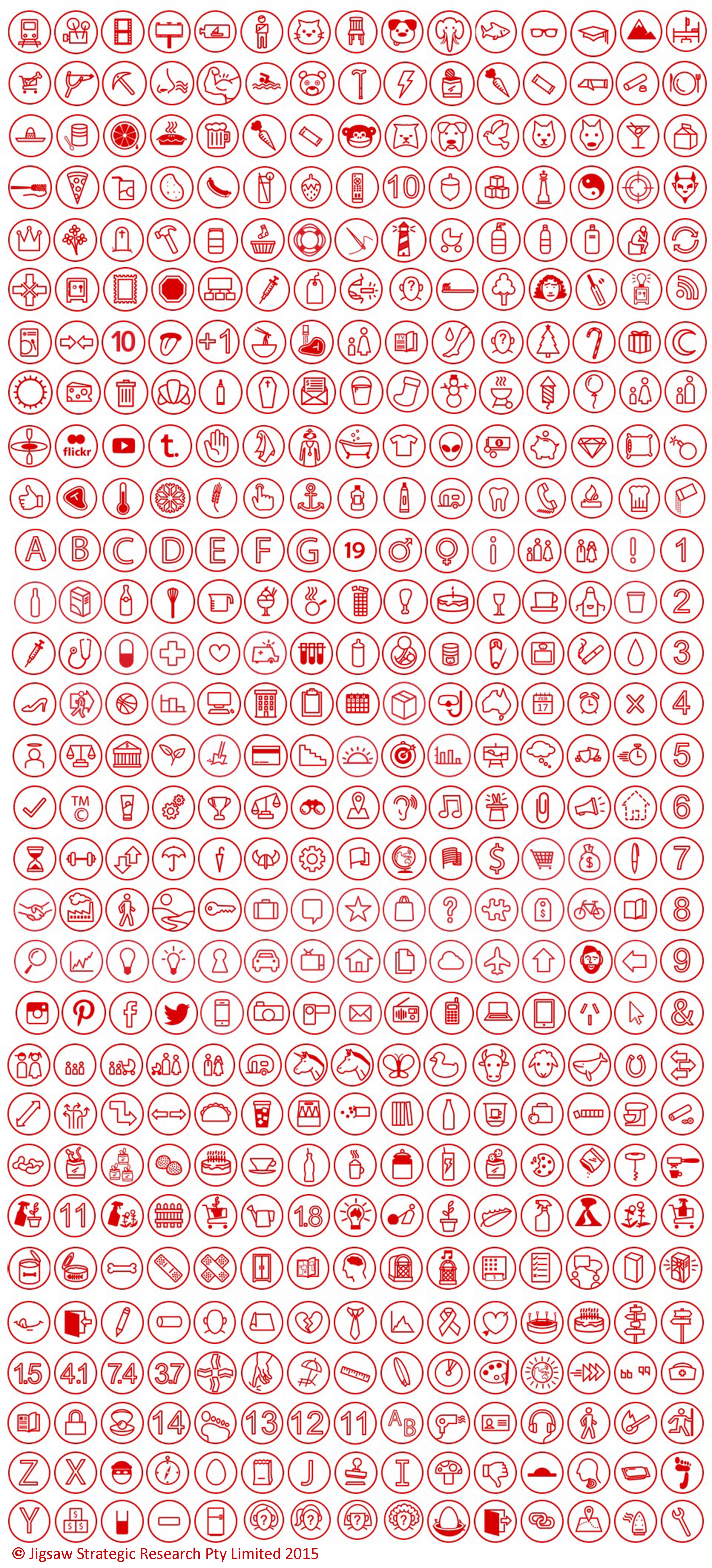
After Jigsaw had a rebrand 3 years ago by Christopher Doyle & Co. we had a clean and crisp new design direction, as part of that design Chis created about ten icons to use in our presentations with the plan for me to create more as time went on. Over the past three years I’ve been busy in Adobe Illustrator morphing the same 14pt red lines into soup cans, unicorns, anchors and basketballs. At the moment the icon count sits at 861.
This work has been great for my creative practice as it has taught me to think about how to communicate simply and directly while maintaining a strong aesthetic – A skill which is very valuable in cartooning. My cartoons have become clearer and more focussed which in turn has made them funnier as the reader is able to digest the joke in a shorter amount of time.
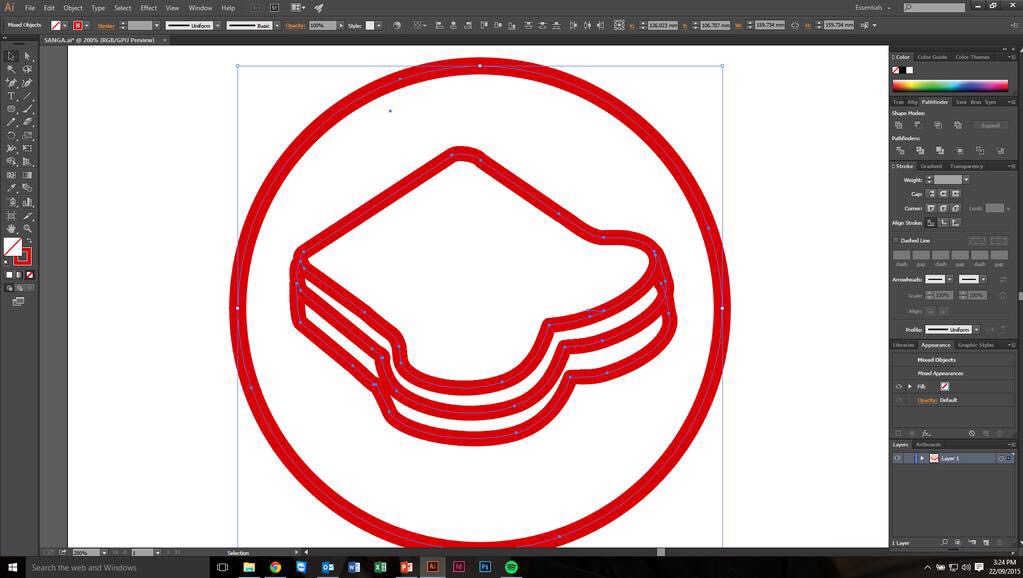
Well all this hard work has made me hungry – I’m off to make a sandwich.

That’s amazing Ed! I’m so impressed!